
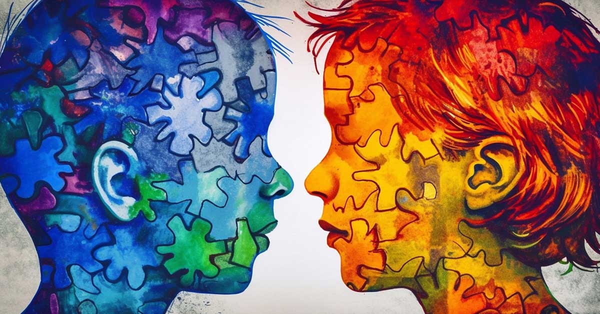
Color is a language of its own, a powerful tool that designers wield to convey emotions, establish brand identity, and captivate audiences. At the heart of this visual language lies color theory, a fundamental aspect of graphic design that guides the creation of harmonious and impactful color palettes. In this guide, we’ll explore the principles of color theory and how designers can artfully craft palettes that resonate with their audience.
1. Understanding the Color Wheel
At the core of color theory is the color wheel, a visual representation of the relationships between colors. The wheel is divided into primary colors (red, blue, yellow), secondary colors (green, orange, purple), and tertiary colors (a mix of a primary and adjacent secondary color).
2. The Basics: Hue, Saturation, and Brightness
- Hue: The specific color on the color wheel.
- Saturation: The intensity or vividness of a color.
- Brightness (Value): The lightness or darkness of a color.
Understanding these basics empowers designers to manipulate colors intentionally and create the desired visual impact.
3. Color Harmony: The Rule of Analogous Colors
Analogous colors sit next to each other on the color wheel. This harmonious combination creates a serene and unified palette. Designers often leverage analogous colors for a cohesive and balanced look, perfect for conveying a sense of unity in a design.
4. Contrast and Drama: Complementary Colors
Complementary colors are positioned directly opposite each other on the color wheel. When used together, they create high contrast, making elements stand out vividly. While powerful, designers should use complementary colors sparingly to avoid overwhelming visuals.
5. Balancing Act: Split-Complementary Colors
A split-complementary palette involves selecting a base color and then using the two colors adjacent to its complement. This provides the contrast of complementary colors while maintaining a more balanced and harmonious look.
6. The Triadic Dance: Triadic Colors
Triadic color schemes involve three colors equally spaced around the color wheel. This approach creates a dynamic and vibrant palette while ensuring a degree of balance. Designers often choose one dominant color and use the others as accents.
7. Quadruple Harmony: Tetradic Colors
Tetradic color schemes involve four colors together in the form of two complementary color pairs. This versatile scheme offers a rich and varied palette. Designers can experiment with different combinations to achieve diverse visual effects.
8. The Soothing Scheme: Monochromatic Colors
Monochromatic color schemes focus on variations in lightness and saturation of a single hue. This creates a soothing and elegant look, perfect for conveying a sense of simplicity and unity.
9. Embracing Warmth and Coolness: Temperature in Color
Colors are often categorized as warm (reds, oranges, yellows) or cool (blues, greens, purples). Understanding color temperature helps designers evoke specific emotions. Warm colors convey energy and vibrancy, while cool colors evoke calmness and serenity.
10. Cultural Connotations: Understanding Color Symbolism
Colors carry cultural and psychological meanings. Red may symbolize passion or urgency, while blue conveys trust and stability. Designers must consider these associations to ensure their color choices align with the intended message.
11. Hierarchy through Color: Establishing Visual Importance
Use color to establish hierarchy in design. Bold, vibrant colors can draw attention to key elements, guiding the viewer’s eye through the intended visual journey. This is particularly crucial in layouts with multiple elements.
12. Testing Accessibility: Color for All Audiences
Consider accessibility by ensuring your color choices accommodate users with color vision deficiencies. Designers can use tools to check color contrast and choose palettes that are inclusive and readable for a diverse audience.
13. Inspiration from Nature: Incorporating Color Harmonies
Nature provides a wealth of harmonious color combinations. Observing landscapes, flora, and fauna can inspire designers to create palettes that resonate with the organic balance found in the natural world.
14. Psychological Impact of Color: Influencing Emotions
Colors have a profound impact on emotions and perceptions. Warm colors can evoke passion and excitement, while cool colors may induce calmness and trust. Designers should align color choices with the emotional response they want to elicit.
15. Consistency in Branding: Establishing a Signature Palette
For brand identity, consistency is key. Establishing a signature color palette helps in brand recognition. A well-defined and consistently applied color scheme becomes an integral part of a brand’s visual language.
Conclusion
Mastering color theory in graphic design is a journey of exploration, experimentation, and creative expression. Designers who understand the principles of color harmony, contrast, and symbolism can strategically apply these concepts to create visually stunning and emotionally resonant designs. As the palette becomes a storyteller in its own right, designers wield the art of color theory to not only capture attention but to convey a narrative that lingers in the minds and hearts of their audience.

Comments are closed