
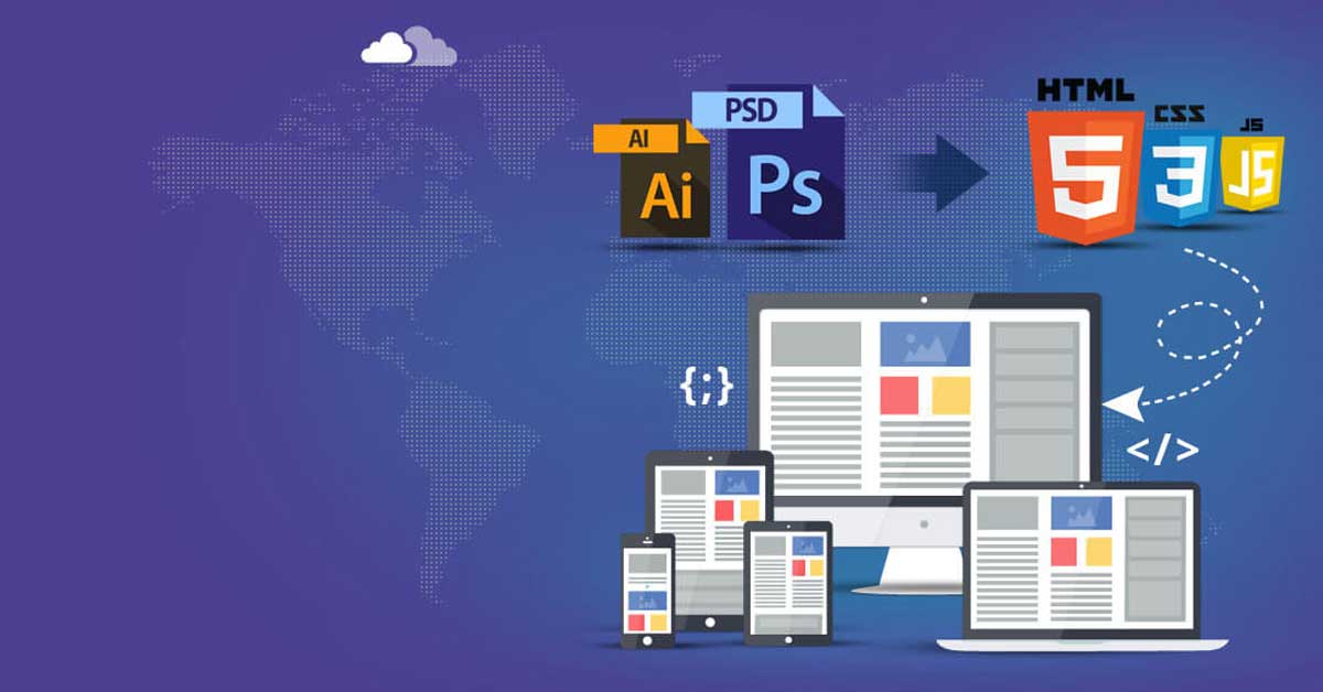
Converting a Photoshop Design (PSD) into responsive HTML is a crucial step in creating a website that adapts seamlessly to different devices, including desktops, tablets, and smartphones. This process involves translating the static design elements into a dynamic and flexible layout. Here’s how to achieve a responsive PSD to HTML conversion for optimal display on all devices:
1. Prepare the PSD File
- Organize Layers: Arrange layers logically and group related elements to streamline the conversion process.
- Identify Design Breakpoints: Recognize key breakpoints for different screen sizes (e.g., mobile, tablet, desktop) within the PSD design.
2. Start with a Mobile-First Approach
- Mobile Layout Design: Begin by coding the mobile layout, focusing on simplicity and essential elements.
- Use Fluid Grids and Flexible Images: Utilize percentage-based grids and images that scale proportionally to the viewport size.
3. Coding the HTML Structure
- Semantic HTML: Write clean, semantic HTML5 code that reflects the structure of the design and aids accessibility.
- Implement Responsive Meta Tags: Include viewport meta tags to ensure proper scaling and responsiveness on mobile devices.
4. CSS Styling for Responsiveness
- Media Queries: Create CSS media queries to apply specific styles based on screen width breakpoints defined earlier in the design.
- Flexbox or Grid Layouts: Utilize CSS Flexbox or Grid for creating responsive layouts and positioning elements.
5. Optimize Images and Media
- Image Compression: Compress images without compromising quality to reduce load times on different devices.
- Use SVGs and Icon Fonts: Employ scalable vector graphics (SVGs) and icon fonts for sharper and flexible images.
6. Testing and Debugging
- Cross-Browser Compatibility: Test the website across multiple browsers (Chrome, Firefox, Safari, etc.) to ensure consistent performance.
- Device Testing: Use device emulators or conduct real-device testing on various smartphones, tablets, and desktops to check responsiveness.
7. Accessibility and Performance
- Accessibility Features: Ensure the site is accessible to users with disabilities by adhering to accessibility guidelines.
- Performance Optimization: Minimize HTTP requests, leverage browser caching, and utilize content delivery networks (CDNs) for faster loading times.
8. Adaptive Design Considerations
- Device Orientation Handling: Account for changes in device orientation (portrait/landscape) and ensure the layout remains user-friendly.
- Touchscreen Optimization: Optimize interactive elements for touchscreens, providing a smooth and intuitive user experience.
By following these steps and paying attention to details during the PSD to HTML conversion, developers can create a responsive web design that caters to users on various devices, offering an optimal viewing experience across the board.

Comments are closed